In early 2019 I participated in the Hudson Alpha Tech Challenge with the goal of solving problems relating to life sciences. You have 48 hours to create a functioning application, a video explaining your solution and if selected give a presentation on your solution to members of the community.
We were selected as finalists!
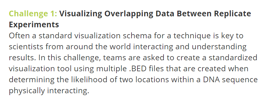
There were three challenges presented and we tackled the first of the challenges.
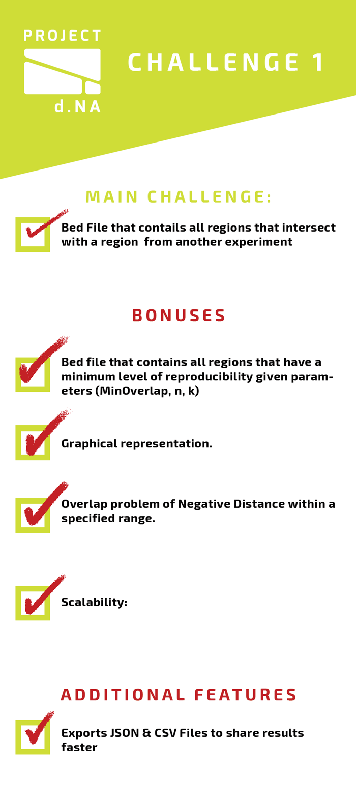
The challenge that we tackled.
My role was as the graphic designer and also to manage the team. We had three people including myself - one data scientist, one software engineer and me. One of the first things I did was establish the visual of the product, this can take on many shapes per person but I went after the logo and logotype. I wanted simple, clean, modern and life science like.
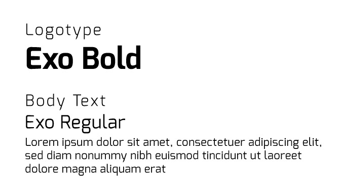
Next was the typefaces to be used throughout the entire production. One of the challenges of a 48 hour competition is you have to make decisions and trust your instincts. I was familiar with different tech typefaces so I went with a tried and true typeface with a variety of weights, Exo.
Part of the challenge was also to produce a video explaining our success/process. Here is that video:
Something that sells an idea - and I believe part of the reason we were selected as finalists - is having a splash image that encompasses feelings of your product. It's about drama and a feeling more than it is about the technology that supports the idea. I created this image as a sort of homage to how powerful DNA can be, in breaking through a tumultuous health experience.
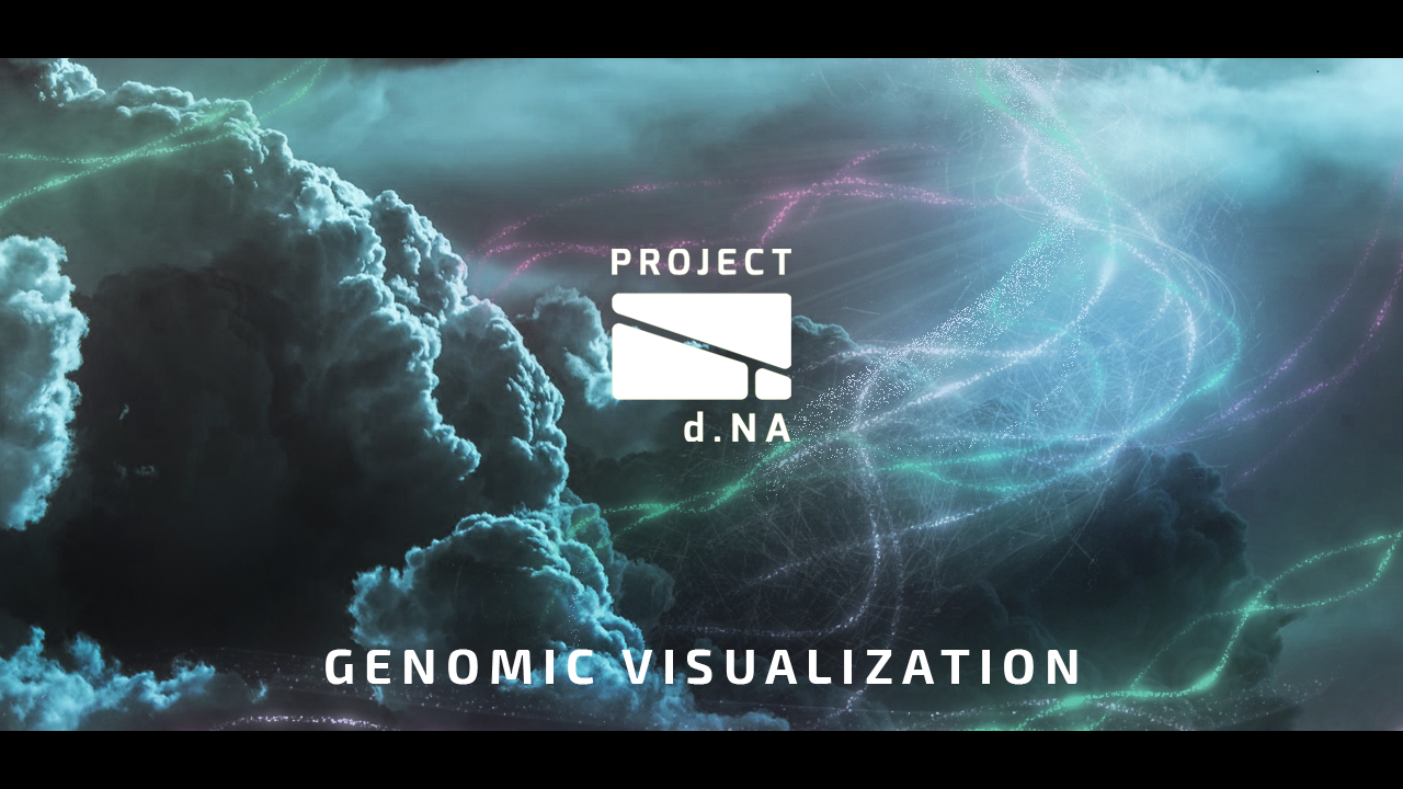
I wanted something dramatic and that would start off the presentation with a big impact. Something almost supernatural about the genetic information contained within all of us.
We were also tasked with creating a devpost, here are some of the graphics I created to explain our idea to people.