One of the first tasks I had when starting at Mentor Enterprises was rebranding the line products. This included typography, iconography and imagery, brand colors and eventually the tone of our online presence.
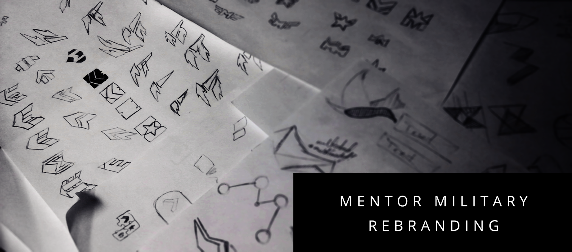
One of our first aims was redesigning the logo and logotype. The old branding didn't tell people the full range of our products and services offered. Customers thought we focused exclusively on print when Mentor had a breadth of software, mobile apps and websites that catered to the military professional.

Here are some explorations with different font treatments. An initial direction was that we wanted the design to read as related to publishing. After hearing feedback from some followers we decided that our branding aim was a multi platform approach. We didn't just focus on print, but a whole suite of tools for the users.
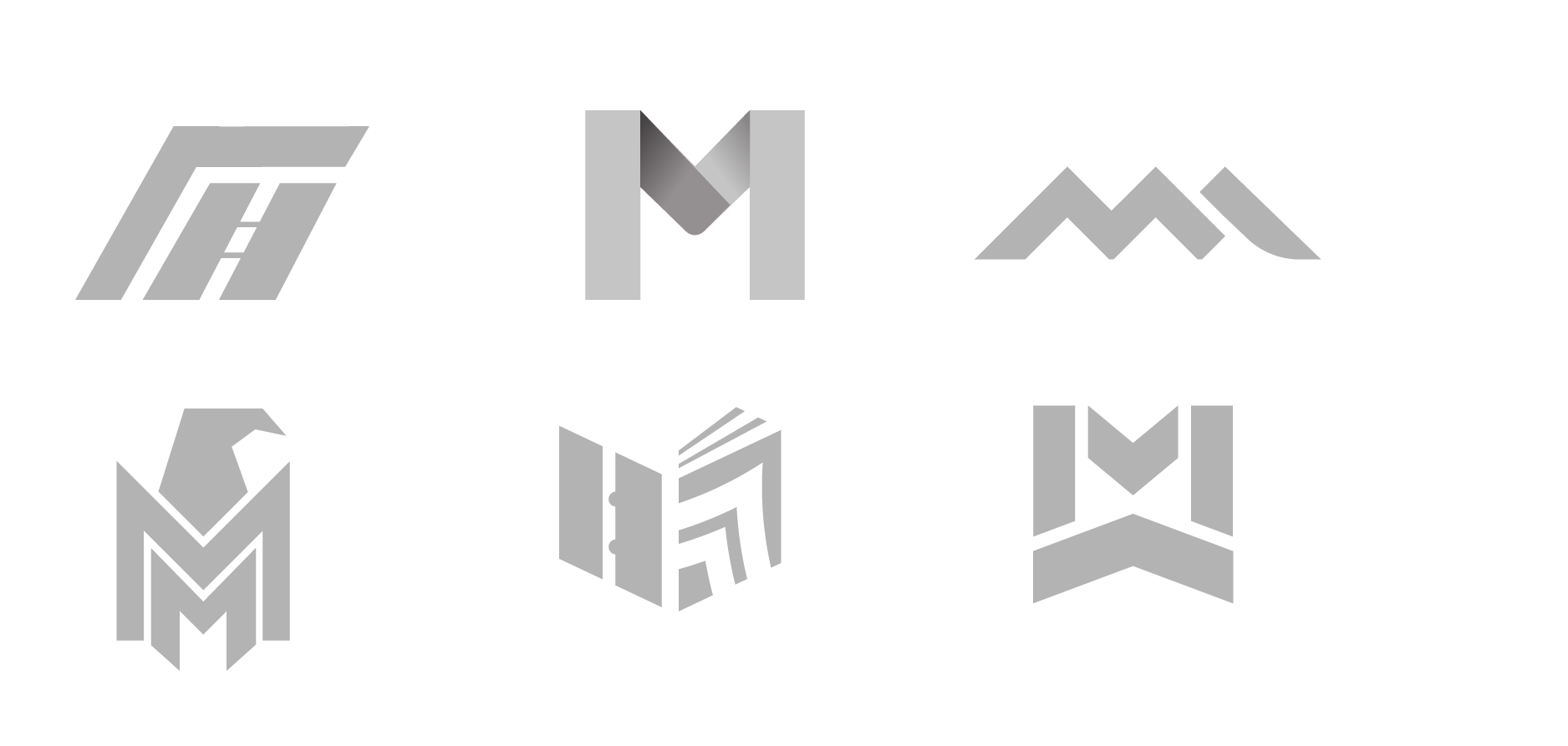
After the initial round of feedback we reexamined our design aims - a design that supported multiple platforms(print, digital, animated) and came up with a selection of new designs that more closely related a "tech" feel. We also wanted to support the "stacked" feel of military ranking.
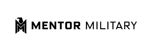
We eventually settled on a final look.
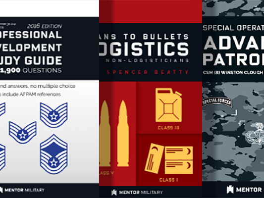
After established a look we began immediately mocking up and publishing updated content to all our platforms. Book covers had to be redesigned to feel the new, more modern and forward leaning approach. Our applications needed to better match the cleaner and more streamlined look.
Check here for some of our cover variants.
Check here for some of our website plans.