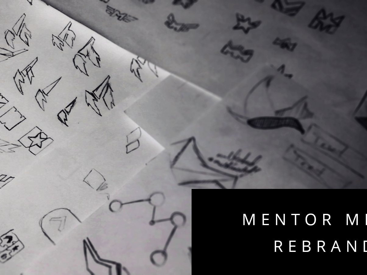
After rebranding towards a more modern design direction the team redoubled its efforts in designing a consistent look for the covers. Emphasis was on having a design that stood out on the shelves of outlets, demonstrated a consistent brand to potential customers and was a fresh departure from the photographic elements that dominate other brands.
We settled on iconography—often employing seals, ranks and emblems from the military—as our main visual driver with a strong top heavy title.
Often times, the covers were the result of collaboration between the in-house design team and the authors of the book.
Moreover, we wanted to preserve a sense that there were different "tiers" of works. Some covers belonged to books within a series, while others were singular works and their covers reflected that.
The result is that the print books were easily recognizable for potential customers and demonstrate a huge range of resources available to military professionals.


